
Features
Biophilic Design, More Than Just Plants!
Bill Browning
Share
Our good friend David Gerson at Inscape has a Google alert for articles on biophilic design. Lately these articles have been numerous. We feel honored that Terrapin’s work and publications have been featured in a number of these articles. That said, there seems to be one point that we need to raise again and again. Biophilic design is more than just adding plants to a space, or to frame it another way, adding plants can be a strategy for implementing one pattern, a Visual Connection to Nature. There are 13 other ways to connect with nature in the 14 Patterns of Biophilic Design, each with a unique scientific backing and each supporting different psychological or physiological outcomes. But before we get to those, let’s take a deeper look into that most common of biophilic design interventions: bringing live plants into the built environment. Oh and fair warning, portions of this article are based on my speculation (with a hope that the science will catch up eventually).
Visual preference studies are used to track what people find more pleasing. In the 1970s a study in an open office looked at which was more preferred, a row of the same ficus trees or a small cluster consisting of a ficus tree with several different plants of various heights. The cluster was more preferred. Our friend biologist, Janine Benyus has said that this response may be due the brain saying “Oh, look there is a little habitat, so this must be a good place to be”.
Similarly, we suspect that a small, beautifully designed biodiverse green wall may have more impact than a giant green wall planted as a monoculture. This might also explain the appeal of mini habitats. An assemblage of small plants in a terrarium or a well-trained bonsai tree seems much more interesting than the same plant alone in a pot. This appeal may stem from the way a good terrarium or bonsai evokes a miniature landscape. We can almost imagine being there.
A significant consideration of live plants is the maintenance they require. While some plants are hardier than others, all plants are susceptible to demise. And there is nothing more sad than a bunch of dead potted plants or a failed green wall. So bite the bullet and commit to maintenance and make sure that you put plants in places where they have an opportunity to survive.
There may be situations where live plants won’t work. In these cases consider preserved moss–done well it maintains the feel and look of live moss–or, if out range of touch, really good artificial plants. Why out of our range of touch? Think about the experience of seeing some really beautiful flowers, walking up to them, touching them and discovering they were fake. Notice how your hand jerked back, you felt disappointed. We know that the brain sorts between living and non-living motion almost instantaneously, that process may be happening here. Your subconscious told you the plants were real. You are almost embarrassed to discover your subconscious was wrong. Another downside of artificial plants is that they are inherently static, there is no scent, no growth and change, both of which are really important characteristics of live plants.
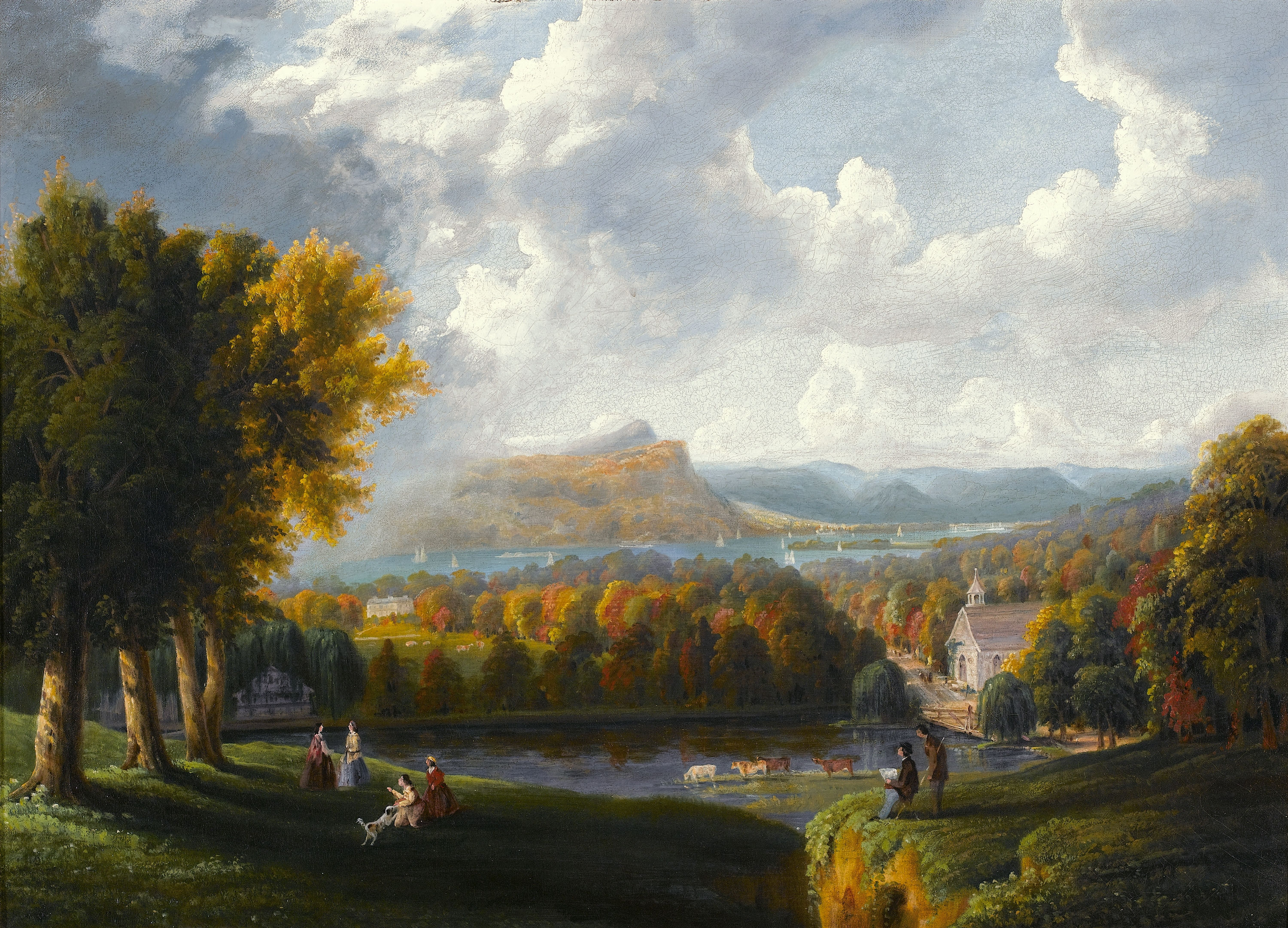
While we are still on the topic of plants, it should be said that not all landscapes are equally effective. Landscape geographer, Jay Appleton’s work pointed out that we can be looking in one direction and say the view is beautiful and turn 90 degrees and feel quite differently. He noted that preferred views had the conditions he identified as prospect and refuge. These views also had semantic content, or elements that we find appealing.
A good explanation of those elements or semantic content comes from the work of our colleague and mentor, environmental psychologist, Judith Heerwagen along with Gordon Orlens. They are responsible for the Savanna Hypothesis, the idea that since the best evidence is that our species arose on the savannas of Africa, it makes sense that we would have a strong preference for places that replicate some of those conditions. Prospect views, streams, copses of shade trees, calm grazing animals, a predominance of low growing grasses and understory are all characteristics of the savanna, Now, we see these same design characteristics in our own landscape design, from parks and golf courses to campuses and suburban yards. Human-made savannas are not just a western cultural artifact, good portions of the US landscape, pre-European contact, were savannas maintained by annual burning by the indigenous peoples. We love savannas.
A thicket edge or a deep dark forest, however, can elicit a fear response. This seems to sometimes be forgotten. In one example, a linear rain garden using mostly native species was installed along a street in a medical campus. It was quite successful, both functionally and aesthetically, except for one portion. Along the route there is a side garden with seating areas, which is almost never used. The small rooms created in the garden have a nice tree canopy, but are surrounded by a tall understory that creates a thicket condition in which it is not possible to see in or out of the seating areas. In a private garden, this might be okay. On an urban street it feels unsafe.
One last thought on landscape design, particularly around schools, office buildings, and other workplaces. Most frequently landscapes are designed along the entrance or in locations visible from roads or parking lots, where. we get the best views on the way in and out of the buildings. Since we spend much of our day inside the buildings, how about designing with a consideration of the view from inside as well?
So what about all those other Patterns of Biophilic Design? The patterns that fall within the grouping of Nature in the Space are relatively obvious, although the second pattern, Non-Visual Connection to Nature, bears repeating. As designers, we all too frequently default to how things look, which makes sense as vision is our primary sensory system, however experiences have more impact if they can trigger multiple senses. Most notably, nature sounds have an uncanny ability to calm occupants and draw attention away from other distracting noises rampant in many indoor environments. See our most recent report, An Ear for Nature, for a look at the fascinating sciences behind this response.
The second grouping, Natural Analogues is one that can support a lot of experimentation. In particular, we believe there are many unexploited opportunities to use layered fractals in fabrics, wallpapers, flooring, and ornamentation. We are mesmerized by the balance of complexity and order in natural environments. Very few things can capture our attention as well as a roaring campfire. We can stare at it for hours. This is in-part due to the fractal patterns created as the fire rises. Researchers have found that our brains emit a pleasure response (in the form of dopamine) when we stare at fractals. As a design pattern, this condition can take many scales: from furniture and detailing patterns to spatial layout.
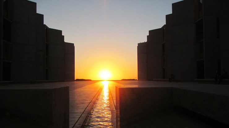
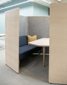
The patterns within the third grouping, Nature of the Space seem to be more frequently discussed and experimented with in recent years. As the shift to open offices with non-assigned work spaces is occurring, we are encountering more and more spaces that are prospect dominated. There seems to be evidence that these spaces help support collaboration. However, the predominate problem in this type of office design (besides the noise issues) is the sore lack of refuge experiences. Spaces that provide a refuge condition can have an amazing variety, starting at the scale of a single high backed wing chair, to booths, small break rooms, all the way to outdoor courtyards. The question we frequently hear is, “what is the exact number of refuge spaces needed for a given number of workstations?” For that, we don’t have answer, the need for spaces for retreat and restoration is really dependent on the mixture of work types, tasks, stress level and introvert/extrovert balance of a population in a space.
One very important point about the 14 Patterns is that unlike a traditional pattern language, they are not describing specific design techniques or objects. Rather, these are 14 different ways of experiencing nature. Each of these patterns can be achieved with multiple different strategies, which can and should be adapted based on the culture and ecology of a specific location. Most importantly, they warrant and celebrate interpretation, through the lens of the designer in response to place.
These different experiences can help support different outcomes. Some of the patterns support stress reduction, others improve cognitive function, and some help improve mood and preference. A chart listing the differing outcomes can be found on page 12 of 14 Patterns of Biophilic Design. Creating a narrative about the needs of the users of a space can help you filter which of the patterns will be most valuable in a space. We have learned that really good spaces might use 3, 4 or more patterns, but there is usually one strong pattern that most determines the outcomes for that place. With limited budgets and space, this process can help to determine the most effect place and strategy for a design intervention helps to reconnect us to nature.
Filed under:
Topics
- Environmental Values
- Speaking
- LEED
- Terrapin Team
- Phoebe
- Community Development
- Greenbuild
- Technology
- Biophilic Design Interactive
- Catie Ryan
- Spanish
- Hebrew
- French
- Portuguese
- Publications
- Occupant Comfort
- Materials Science
- Conference
- Psychoacoustics
- Education
- Workshop
- Mass Timber
- Transit
- Carbon Strategy
- connection with natural materials
- interior design
- inspirational hero
- biophilia
- economics of biophilia
- Sustainability
- wood
- case studies
- Systems Integration
- Biophilic Design
- Commercial
- Net Zero
- Resorts & Hospitality
- Energy Utilization
- Water Management
- Corporations and Institutions
- Institutional
- Ecosystem Science
- Green Guidelines
- Profitability
- Climate Resiliency
- Health & Wellbeing
- Indoor Environmental Quality
- Building Performance
- Bioinspired Innovation
- Biodiversity
- Residential
- Master Planning
- Architects and Designers
- Developers and Building Owners
- Governments and NGOs
- Urban Design
- Product Development
- Original Research
- Manufacturing
- Industrial Ecology
- Resource Management
- Sustainability Plans
- Health Care
- Carbon Neutrality


